As the world adjusts itself to living in a pandemic, part of that new normal is the move to conducting more training online. However, eLearning is a very different platform to face-to-face training, and what works in the classroom may not necessarily have the same effect online.
Elearning courses are highly reliant on its design to make it engaging and effective. So, here are some common design mistakes that you should avoid when creating an eLearning delivery:
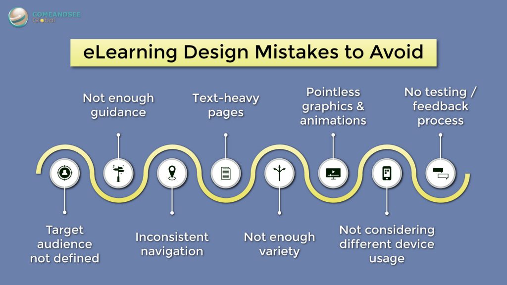
- Target audience not defined
While this may not be a complete list, it will provide a general guideline to help you deliver a sound eLearning The fact is, there is no one-size-fits-all for eLearning courses. A target audience should first be identified, so the course could then be designed in a way that caters to their abilities, experiences, needs and sensibilities.
- Enough guidance
While instructors set the pace during face-to-face training, learners may be left to their own devices when navigating an eLearning course. Therefore, it is important to provide instructions on how to proceed, or learners could be left confused and frustrated. Remember, what seems intuitive to you, may not be so clear to others.
- Inconsistent navigation
If the ‘next page’ button appears on the bottom right of the screen the first time, people will usually expect it to also be there for subsequent pages. Keep the layout of your navigation buttons consistent so the learners don’t waste time trying to figure out how to navigate.
- Text-heavy pages
Too much text on the screen can be boring and hard to digest. Bullet points lose value if each are several lines long. Remove information that is not relevant and try to highlight only key concepts. Alternatively, you can transform the text into meaningful graphics that can convey the same message without cluttering up the screen. Remember a picture speaks a thousand words!
- Not enough variety
As many eLearning courses are self-directed, they depend on the learner’s motivation to continue. Going through a course that is monotonous in its delivery can reduce their level of engagement and drive. Shake up the pace by mixing up activities, interactions, animations and so on.
- Pointless graphics and animations
On the other hand, you should not put random graphics or animations on the screen just for the sake of having it, as this will only become a distraction to the learner. They should add value to the learning experience; otherwise, leave it out.
- Not considering different device usage
Your course might look great on a computer screen, but how does it look on a mobile device? Is the text too small to read, and the buttons hard to click? As more and more people opt to use their smartphones for different functions, learners might get turned off a design that is not mobile responsive.
- No testing or feedback process
Nothing ends up perfect from the get-go, even with planning and experience. Get others from your team to test the course during the development stage to make sure that everything is working as it should. And gather feedback from your learners to see where else you can improve your course.
While this may not be a complete list, it will provide a general guideline to help you deliver a sound eLearning experience.